Project on Data Visualisation with R
Self-paced videos, Lifetime access, Study material, Certification prep, Technical support, Course Completion Certificate
Uplatz
Summary
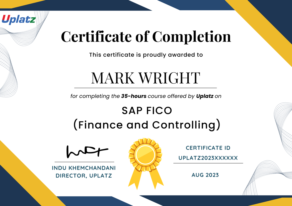
- Uplatz Certificate of Completion - Free
Add to basket or enquire
Overview
Uplatz provides this in-depth course on Project on Data Visualisation with R. It is a self-paced course consisting of video tutorials. You will be awarded Course Completion Certificate at the end of the course.
Data visualization with R involves using the R programming language and its associated packages to create graphical representations of data. Visualization is a crucial aspect of data analysis as it helps in exploring patterns, trends, and relationships within datasets, as well as communicating insights effectively to stakeholders.
R provides several packages specifically designed for data visualization, with ggplot2 being one of the most popular ones for creating static visualizations and plotly for interactive visualizations. These packages offer a wide range of functions and capabilities to customize visualizations according to the specific requirements of the analysis.
In the data visualization process with R:
Data Preparation: Before visualizing data, it's important to ensure that the data is cleaned, formatted, and prepared appropriately. This may involve tasks such as removing missing values, transforming variables, and aggregating data if necessary.
Choosing Visualization Types: Depending on the nature of the data and the insights you want to convey, you'll select appropriate visualization types such as scatter plots, bar charts, line charts, histograms, heatmaps, etc.
Creating Visualizations: Using R packages like ggplot2 or plotly, you'll create visualizations by specifying the data to be visualized and the aesthetics mapping (e.g., x-axis, y-axis, color, size) within the plot. These packages follow a layered approach, allowing you to add multiple layers to the plot to customize its appearance.
Customizing Visualizations: Visualizations can be customized extensively to improve clarity and effectiveness. This includes adding titles, labels, legends, adjusting colors, fonts, themes, and annotations to highlight important insights.
Interactivity (optional): If interactive visualizations are required, packages like plotly provide functionalities to create plots with interactive features such as zooming, panning, tooltips, and hover effects, enhancing the user experience and allowing for deeper exploration of the data.
Iterating and Refining: It's common to iterate on visualizations based on feedback, insights gained from exploratory data analysis, or changes in analysis requirements. Continuous refinement of visualizations ensures that they effectively communicate the intended message and insights.
Sharing Visualizations: Once created, visualizations can be exported as image files or embedded in reports, presentations, or web applications. Interactive visualizations can be shared online via web hosting platforms or embedded in web pages to reach a wider audience.
In summary, data visualization with R empowers data analysts, scientists, and researchers to explore, analyze, and communicate insights from data in a visually compelling and informative manner. It plays a crucial role in the data analysis workflow, aiding decision-making processes and driving actionable insights from data.
Certificates
Uplatz Certificate of Completion
Digital certificate - Included
Course Completion Certificate by Uplatz
Course media
Description
Learning data visualization using R offers several benefits:
Widespread Adoption: R is one of the most widely used programming languages for statistical computing and data analysis. It has a large and active community of users and contributors, making it a popular choice for data visualization among data scientists, statisticians, and analysts.
Rich Ecosystem of Packages: R has a vast ecosystem of packages specifically designed for data visualization, including ggplot2, plotly, ggvis, leaflet, and more. These packages offer a wide range of functionalities for creating static and interactive visualizations, enabling users to explore and communicate insights effectively.
Flexibility and Customization: R provides a high level of flexibility and customization in data visualization. With packages like ggplot2, users can easily customize every aspect of their plots, including aesthetics, themes, colors, labels, and annotations, to create visually appealing and informative visualizations.
Reproducibility: R facilitates reproducible research and analysis workflows. Visualizations created using R can be scripted and documented in R Markdown documents or Jupyter notebooks, allowing users to generate reports with embedded visualizations, share code, and reproduce analyses easily.
Integration with Data Analysis: R seamlessly integrates with other data analysis tools and libraries, such as the tidyverse ecosystem (which includes dplyr, tidyr, purrr, etc.), statistical modeling libraries (lm, glm, lme4, etc.), and machine learning libraries (caret, randomForest, xgboost, etc.). This integration enables users to seamlessly transition from data manipulation and analysis to visualization within the same environment.
Interactivity: R packages like plotly allow users to create interactive visualizations with features such as zooming, panning, tooltips, and hover effects. Interactive visualizations enhance the user experience and enable deeper exploration of data, making it easier to uncover patterns, trends, and insights.
Career Opportunities: Proficiency in data visualization with R is highly valued in the job market, especially in roles such as data analyst, data scientist, business intelligence analyst, and research scientist. Mastering data visualization with R can open up a wide range of career opportunities in various industries, including healthcare, finance, marketing, and technology.
Community Support and Resources: R has a vibrant community of users, developers, and educators who actively contribute tutorials, documentation, and resources to help learners at all levels. Online forums, user groups, and social media platforms provide valuable support and networking opportunities for R users.
Learning data visualization using R equips individuals with valuable skills for exploring, analyzing, and communicating insights from data, enabling them to make informed decisions and drive impact in their respective fields.
Who is this course for?
Everyone
Requirements
Passion and determination to succeed!
Career path
- Data Visualisation Analyst
- Data Visualisation Developer
- Data Visualisation Engineer
- Data Analyst
- Data Scientist
- Data Engineer
- MI Analyst
- Reporting Analyst
- R Programmer
- BI Developer
- Data & Analytics Professional
- Data Consultant
- Software Engineer
- Software Developer
Questions and answers
Currently there are no Q&As for this course. Be the first to ask a question.
Reviews
Currently there are no reviews for this course. Be the first to leave a review.
Legal information
This course is advertised on reed.co.uk by the Course Provider, whose terms and conditions apply. Purchases are made directly from the Course Provider, and as such, content and materials are supplied by the Course Provider directly. Reed is acting as agent and not reseller in relation to this course. Reed's only responsibility is to facilitate your payment for the course. It is your responsibility to review and agree to the Course Provider's terms and conditions and satisfy yourself as to the suitability of the course you intend to purchase. Reed will not have any responsibility for the content of the course and/or associated materials.